Saturday, 6 April 2019

A Anna Arminen was a selected artist in the Lahti Miniprint exhibition 2014


I have had to resort to drastic measures

I came across this today and thought 

YES....I am going to do that to kick start my blog back into life.  I have so many things that I had intended to post on here so this April of 2019 is participating in the A to Z blog challenge.  For the next 26 days I will start my post with the subsequent letter alphabet.  Today is A.


A

Here I  am ....finally writing a post about my experiences of making submissions to Lahti Miniprint in Finland.  I was also selected to be in the above mentioned Lahti exhibition.  

The image pictured LEFT is by Anna Arminen  (Finland ) and was selected for exhibition at 2014 miniprint Lahti (technique/media digital Print)

I’ll tell you something perplexing about that, well that is from my perspective.

 A long long time ago......back when the very first Lahti Mini print that was ever held (which took place in 1998 or thereabouts) - AND I was selected to be in it.


As it was among the very first print biennials triennials and so forth,  that I had ever applied for
- I was delighted, I had entered an accordion like print which had three ‘pages’.

I dont know if I have a photo of it.  I do still have it and will photograph it and insert it asap. Anyway I was a lot less experienced at that time and although there was no printed catalogue book I was ever so pleased just to be included in the exhibition.    

And as time went by AND after having my submissions selected for various print biennials etc  and the like -  I decided that I would only enter printmaking ‘events’, IF there was going to be printed catalogue book.

You see because of my disabling pain inducing chronic condition getting together several framed pieces of artwork for a show is utterly exhausting.
It takes me many days to recover.  From the beginning of 2017 in addition to the pain I already had, I developed something horrible called PND (Peripheral Nerve Damage).
This was in the toe area of my right foot mainly.
This is supposed to be my “good” foot. LOL !!!
The nerves in my left leg from the knee downwards are fairly useless since I had a ’stroke’ of sorts in about 2008.
Anyway the main point I am making here is that ‘overdoing’ things where I am concerned with studio activities puts me in danger of triggering that PND.  Have you ever had a nerve type pain in your teeth?……..well imagine several of those twinge/ aches intertwining inside the top area of your right foot.  It is terrifying.
So I am ‘between a rock and a hard place’ as they say.  They have prescribed tablets to keep this PND

pain at bay and I take one every night and it seems to work - I am so grateful that the doctor who
suggested that, was correct.  It’s ironic because when I saw him at the practice - he was a temp-stand-in-doctor and I thought “oh god he is probably going to tell me to listen to a relaxation tape or something equally annoying etc.”.  I am glad I was wrong in my estimation.

In summary getting together a submission of unmounted  prints to post off to China Taiwan Poland Japan etc etc......I can just about manage to do.  Anything more physically demanding is a real trial.   My partner C. takes them to the post office for me or if I am feeling 'up to it' I will get driven there and go in and deal with it in person.
IMAGE ABOVE: "Perduras Dream". copper plate etch on Pigment inkjet on Hahnemuhle

OK getting back to my initial digression regarding Lahti Finland Miniprint.

I submitted the next time and didn’t get selected - in that case, I checked and then realised that I misconstrued the sizes.  I didn’t bother the next time it came around.  The following event I
submitted and yet again was not selected.
During this time I purchased a couple of their catalogues and they were really very very good. In fact one of these catalogues is among my favourites from my collection of art exhibition catalogue books.

Anyway so last time round I decided I would have another go and this time there was a theme of sorts I can't remember what it was although it might have had something to do with infinity or eternity.
So I made 3 mini prints for Lahti or as it was called by then "Finland Miniprint" and hooray I  finally got selected.  The plate size was 17 x 20 cm (7 x 8 inches).  Paper sheet size is 30 x 35 cm (12 x 14 inches) Although its classified as a mini print - its isn't too ridiculously small so I find it to be quite a nice size to work with.

BUT THEN IRONICALLY AND SO SO DISAPPOINTINGLY ……..they informed me that this time they were not in a position to publish  a printed catalogue for the first time.

I was so disappointed.  I seemed to be doomed by Lahti - it was such a shame especially being as it was  something I had so admired.
This was published in August 2015 (I had been in touch with them saying how disappointed I was).  I mean I /we ....do like to see what the other artworks look like in the exhibition.  The catalogue books are a celebration and documentation of the event.
See this at bottom of this post

LEFT: another of the selected Lahti prints
Title: "Ashra's Daughters", collagraph and pigment inkjet (not a great photo but will update with a better one in the near future).

Below are links to the other three exhibitions for which there were printed catalogue books.


a)

2004 catalogue online

b)

2010 catalogue online

c)

2007 catalogue online

Most recent catalogue - the one I finally got selected into!!

https://issuu.com/lahdentaidegraafikot/docs/miniprint-finland-2014-catalog


Friday, 2 November 2018

Paris Exhibition Summer 2018 photos PV + other artists etc (Post no 3/3)

This exhibition took place in 'summer' 2018 (May June and in August)in Paris (see posts below for further info) 
In addition to photos taken at the opening I have included where possible some images from each of the exhibiting artists:


1.  Akane Kirimura
     I think it was Akane who organised/coordinated the exhibition


Akané KIRIMURA, France; if you do visit   http://www.akanekirimura.com/Welcome.html  - you will find absolutely loads of lovely work to look at using a range of techniques + approaches.


2.   Anne Paulus


Anne Paulus, France  


there are artists books, printmaking works and ceramics.  She seems to favour working in a restricted palette.  Its something I have had fleeting thoughts on although never actually done.  Having said that my colours in my earlier works were brighter in colour.


wish I knew who was who?  but have absolutely no idea

3.  Mitsouko Mori


Mitsouko MORI, France


Mitsouko works using silkscreen lithography etching and more recently neon.  She seems not to have a dedicated website so instead there are bits and pieces all over the internet - hard to choose one......

This link takes you to a search on Google:                  https://tinyurl.com/y75ezf2u


4.   Katherine Jones


Katherine is an exceptional artist printmaker - she combines relief and intaglio in such a way that is unique.
The link below is to  a video that you can see on You Tube,  in which she seems to be describing one of the processes she uses in making her prints, involving a stencil through which ink is wiped away?  ......anyway go figure...........


5.   Akira Abe


Akira ABE, Japan  the url below, is best I could find on him:

http://www.mchampetier.com/Akira-Abé-2397-en.html#1


6.   Tiina Kivinen


love the wash-like nature of many of Tiina's etchings

Tiina Kivinen, Finland

http://www.bronda.fi/taiteilija/28/

7.  Kanako Watanabe


Kanako WATANABE, Japan; 

Beautiful subtle graceful moku hanga prints

WATANABE Kanako 

She doesn't seem to have a dedicated website so again a google search seems best option

https://tinyurl.com/y9xgtkrm


Finit

Sunday, 27 May 2018

Artwork for Paris May 2018 Estampes +

Creating Monoprints for "Estampes+" ( May - June 2018) Paris

I spent nearly two weeks making these monoprints.  First I made a series of backgrounds by painting watercolour onto Yupo paper that I placed onto a polypropylene plate.   I also placed some small styrofoam rings onto some of them whilst they were still wet..........


Once they were completely dry - these were then run through the etching press onto dampened blotted paper Fabriano and Hahnemuhle paper.
A practical TIP for those of you making watercolour monotypes - is to use a digital timer to allow them to sit on the press bed, in position with the dampened blotted paper on top and then covered with the blankets - for 3 minutes. This is to give time for 'reactivation' of damp paper on dry paint.


I think I made about eight watercolour backgrounds to potentially develop further into finished monoprints.  BTW - it really is best to use a digital timer because its only too easy to get distracted by a phone call or someone asking you a question and so on and so on.............make sure it beeps and put it in your pocket etc......


I did the turquoise watercolour backgrounds first and decided that maybe these were just a bit too bright / intense ...........


Well you can see for yourselves.  I did end up using some of them although it was the 2nd batch that I  painted the following day - which I used moreso, for the backgrounds.


The next batch of watercolour backgrounds were a mix of ochre blue, yellow and burnt umber.  I have to say theres something very pleasing about working on the Yupo paper and you can easily remove it, in areas where you dont like the 'look' of.

       
On some pieces, I also used a little washing up liquid "Fairy" brand (UK the most expensive) - that's how I got all of those tiny bubble marks.  Having decided which of these watercolour backgrounds  to use it was then a matter of incorporating various elements into the 'picture space'.                                                                                                                                                           
"Daddy Long Legs"

Here an image of a young girl  I had drawn and painted ages ago  combined with an offset impression of a spider and a piece of cotton string that had been 'coloured' with watercolour crayon.

I have to admit this is a pretty tricky strategy as everything has to 'not move' once it has been put in place on the re-soaked  and blotted watercolor background.  It turned out sufficiently OK to 'pass muster' as they say.  I use rice paste on the girl image to adhere to the paper.  It's always best to not use too much paste because otherwise there is always the risk of it 'sliding or skidding' as it runs through the press and making a total mess.


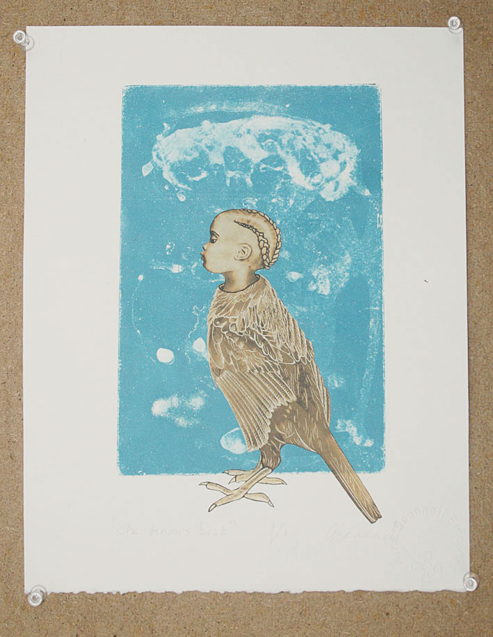
She Knows Best

This image which I had been working on lately didnt seem to integrate well with the watercolour backgrounds so instead I chose to use an aquatint plate made using the addition of water and washing up liquid as the aquatint was developed on the copper plate.  I think she looks really haughty.


This was one of the watercolour backgrounds that I did use although I'm still not quite sure about this one.

It was good to use some of this roughly textured  chine colle paper that had this nice graduated umbre/olive shaded colour.

It's an image of a female of sorts thats been around in my 'encyclopaedia of ciphers' for quite some time.

Thus far it is untitled.


Here (I really liked this back ground) I have incorporated my little emperor (PuYi) who in case you dont know was the last emperor of China.  What a life he lived.   It's an image I am fond of and that I have used previously although I am not sure as to whether it has featured in any of my finished artworks.

I incorporated a drypoint (on textured polypropylene) of a sphinx of an Ancient Egyptian cat.  My brother gave it to me as a bookmark, he had purchased for me in London at the British Museum.
That material really holds the ink well although I didn't bear that sufficiently in mind whilst making this print.

Really I should have done a more thorough wipe-away of the ink on the flat surface - which would have resulted in a paler impression of the plate.


However having said that I find that I have become more accepting of the overall appearance of the finished piece, than I was initially. The little bird (etched copper) was inspired from looking at a book about medieval illuminated manuscripts, another longstanding love of mine.

It doesn't have a title as of yet although maybe I might call it "Dislocation" or words to that effect.  That shape around the bird is a piece of thin cardboard that I varnished with Lascaux acrylic hard ground and when dry I rubbed some water-soluble crayon onto it.


"Sunday Best"

This piece is called Sunday best and it began with this image of a 5 yr old girl (Charlotte May Pierstorff), known by the name "May",who was sent in the postal service in the USA in the early 20th century by her parents.
See full details HERE   They couldn't afford the train fare and were 'sending' her to relatives for a few months to be looked after by them.  Perhaps it then made it possible for them to travel searching for employment.  I am just speculating not knowing of the real story of her family. It was a lot cheaper to 'send her' using that method.  With her being a child of course the USPS  had to deliver her at the address.  I imagine that the parents had not written the 'senders address' onto the 'package'. This was during the very early year of the U.S. postal service.
I loved the story + her photo integrated so well with the picture space I'd created in the watery cream + black coloured  background that I'd made a while back so that became another one of the pieces that I sent to Paris.

untitled                                                    


"Waiting for the Ancestors"

The final images - well the one on the left,  is the last of the four required images sent to Estampes+ 2018.  This was also  an earlier previously created watercolour background monotype.
The little animal figure on the left is lino print onto acid free tissue paper, that image was inspired by  looking at ancient Chinese funerary objects - in this case a container for the ancestors ashes.  The little red circle is imprinted with a tiny dry pointed circle on polypropylene - I love how easy it is to cut this material to a desired shape.


FINIT

Monday, 14 May 2018

Exhibition in Paris May 2018

OK It would have been nice to go along to this exhibition in Paris................but an excursion of this nature would be too exhausting and extremely painful - more than I could bear
In December 2017 - I received an email from artist printmaker called Akane, inviting me to participate in an international exhibition of printmakers, taking place in Paris,  May 2018.  She also mentioned that there would be 5 other artists exhibiting in this show and that its an annual 'event' that they stage at gallery in the city.  I think she said it was called "Estampe+".
YES - I was interested and also keen to know about the other artists ? - I mean I didn't want to show with any who either made sexist, racist or otherwise offencive artwork.  My other concern was I didn't want to exhibit with unprofessional low standard artists.  However having looked up HER portfolio website  I could tell that yep...... it was going to be good all round.
The week before last (i.e., at the beginning of April 2018) - I was thinking “oh great - that's good, jpegs and lists all finished with and emailed off to the exhibition organiser…….

Now I just need to package up the actual artworks in as wide a cardboard tube as I can find, and then post them off to this Paris based group exhibition and that will be that !!  - task done and dusted!” 

I can get on with some new work

Great…but oh oh.............then I got an email from her, saying that my selected artworks were the wrong way round………………
duh…………..what's she talking about…”wrong way round ?- oh no !!”??
Akane said that they needed to 

a) be all the same size

b) be ‘portrait’ orientated

and 

c) that they all should be no more expensive than 200 euros gallery retail price.

Unfortunately I had misunderstood the instructions/specifications she had sent to me, well in advance - which were translated from French, concerning what each artist can show.  The following was included in email instructions I originally received from Akane 

“sizes (Jésus vertical) or 2 raisins”.   I  have to admit I found this translation or phraseology hilarious.

It also said that for the four smaller pieces of art  it would be - “appreciated with a reasonable price”

I have to admit that when I looked properly once again (just this minute in fact)  at the original instructions I had been sent

In addition to sending two larger art works.............
 ........it had also said

four same small sizes on paper of 29.7 x 21cm or 30 x 24 cm vertical(framed by the gallery)

OR 

“four portrait size prints on 30 x 24 cm paper” ............of course she  was correct ..........

It was probably the Jesus reference that threw me………….(what with my traumatic Catholic upbringing and all)

I suppose I was looking through the smaller size pieces that I had and just selecting those that I thought "suitable". 
Because everything takes me so much longer to do now because of the spinal pain being exacerbated by standing/walking………I find myself reluctant to do more than I absolutely  have to.

So I selected the following
“Perduras Dream” it’s a copper hard ground etch on Inkjet - boy I tried so many different hybrid copper etch plates to find which one worked out best.
“Catalan Birdsong” Made using polymer ’spit bite’ hard ground etching and digital chine colle. (landscape orientation)
(To my mind) It would fit into an A4 size picture frame.

“Contemplation” (portrait orientation). Made using a hand spray administered aquatint (I used a salad -oil ‘pump action’ spray).
I also added some collagraph materials to the plate to get the outcome I needed, having decided that  It would be easier to do that than go back and forward, and back and forward to the etching mordant and apply resists / and then remove them etc etc etc.  

Anyway so that is what I did with that image.  Incidentally - the little face is inkjet chine colle.

“Attic” portrait orientation, mainly etching zinc with a small amount of acrylic resist hard ground applied to the top plate, using a stencil mask.  When it dried, 
I just inked the whole thing up.

ASIDE. I think theres a close up photo of this image "Attic", 
in Mark Gravers book “Non Toxic Etching”
https://www.bloomsbury.com/uk/non-toxic-printmaking-9781408113257/

I must say that given that there are a couple of my images featured in that book - it doesn’t seem fair that I don't have a copy of that book in my library.
OMG - I have just been on the web to look up the url for the book and it is so damned easy to get distracted on the Internet especially if you get taken onto PINTEREST.  I do try my best to stay off it.   Unless, of course,  I have a very specific focused objective.

By the way if any of you printmakers who happen to read this have that book will you please have a look in the book for me - and drop me a line in the comments box.....I'd really appreciate it.


Anyways so yeah those were the artworks I was going to send until it was pointed out to me that  as well as needing to all be the same size, they needed to be portrait-orientated because of the way the gallery staff  hang the exhibition/wall space etc, in the gallery.

What I also really liked was that they would also be framing all the pieces that us printmakers would be sending.

So the following week I worked my butt off getting these artworks done - mainly because of this stipulation that the artworks all needed to be portrait orientated.  More on this, to follow.

Monday, 28 November 2016

Printmaking Activities first quarter of 2016


Printmaking Activities first quarter of 2016


Leicester Print Competition March 2016

Started the year off working on some mini prints for Big Print Small Impression which Leicester Print workshop host every few years.  I was in their last one so thought I would have another shot at it.

They also tour the exhibition around the UK a fair bit which is also good.  Last time I think I sold six prints - which is always welcome news.


Co incidentally they used the one I sold 6 of (image above) , in their "Call to Artists" - of course they should really have asked me if that was OK with me............. but I didn’t mind.
It was quite a small size - trying to remember now - it was 10 x 10 cm (4 x 4 inches)


One of the images I was working on was about refugees............ Gawd I got so into it trying out various possibilities - like using carborundum ( no actually it was pastel ground)  on cut out figurative shapes to print on top of the three female figures apart from their faces and another possibility  I was considering was to try out having these Greek 'shrine-like'  artifacts to go above the children's heads (to give the sense of them thinking they were going to some kind of "promised land".

Of course there wasn't going to be one of these 'artifacts' on the mothers head because of course she was the person who was having to 'carry' them all to where ever they might find refuge........the horror and pain of it all ......

Here are 2 images from the countless possibilities involved in the creation process.

These were probably the best two and I will at some stage make these.  I have physically made the little plates for the 'shrine like hats'.    I have also made the little plates for the shroud like coverings (except the faces) for the 3 main figures.  By the way the newspaper text that can be seen in the image (above) refers to Bashar Al Asaads deeds to his own people.  


Here are some 'notes to self'............... regarding technical stuff and signification etc:

NOTES re Refugees and overhead Devices etc

Refugees Image..............desire for home.................different  for child than it is for adult.....................
.................dream of a new life, somewhere safe.....................idea of a shrine.........................................
 

TRY
A cut out polypropylene)  of the house overhead form shape.  The prep with gum Arabic and paint on a layer of see-through (transparent/translucent) white - ish blue watercolour.

OUTLINE the three female figures and cut these shapes  from sandpaper, then glue onto mount board. OMIT THE FACE SHAPES in these ...............................


Depending on how that turns out another possibility is to make the 

figure outlines onto polypropylene that has been scratched/sanded.  

Then fill in the black figure areas with carborundum.  I like the 

affiliation these forms  have of "shrouds" in relation to the plight of the refugees. (Similar to the effect I got when I did the BED PRINTS)


REGARDING RED STITCHES _ HORIZONTAL LINE etc

Could use  wool or thread sewn onto some paper  of the same size................ and then scan in to PS
 - I may need  print out a copy of the image to put stitching on before scanning it into layering process.
Having said that I do like the idea of having the stitching physically present in the finished art work.
it appeals to me aesthetically and metaphorically
another possibility:


Draw the house form in white/ pale blue chalk pastel onto black Somerset printmaking paper and scan in to Photoshop and then overlay it onto refugees.