Sunday 28 April 2019

X is for Xing, Xu, Xiuhua, Xing, Xiao, Xinping, Xianqiao, Xin Lu and Xuewu

Wow that's a mouthful of printmakers names from China.  I have long admired printmakers from China.  Quite often the works will be done on a large scale using relief printmaking and the majority of that will be woodcut.  Having looked at these works in printmaking catalogue books it will be obvious that these have been painstakingly undertaken over several weeks to months, they are really impressive.


“Illusion Dream” woodcut by Zhang XiaoChun 100cm x 70cm
Link to information on him further down


“June in Southern China”  by  Zhou Xing  47 x 50 cm
Link to information on him further down
There are some Chinese printmakers that I have come across - which I wouldn't have known about, had I not participated (following submission and selection) in, International   Printmaking Biennials such as Yunnan and Guanlan, in China.


reduction woodcut by Zhang-Xiaochun
While perusing through some of my printmaking catalogue books I've encountered some very impressive pieces.   However the 'specifications; of the pieces I have particularly liked,  have only had the name of the artist given in Chinese characters so of course, as I don't speak or read the Chinese language its impossible for me to try to find further information about them on the Internet....which is so disappointing and I think that's such a shame.  

"Girls Covering Theirs Faces". lithograph  58 x 48cm  by Su Xinping (link further down)


It would have been quite nice had I been able to get in touch with them through their website.  

Come to think of it that would be useful for them as well as then other people from the art/printmaking world could contact them about featuring them in exhibitions books research and so on.


Silkscreen By XuYi Jian Mei  (no size given)


The other thing which I must apologise for is that with some of the artworks there was no title or no technique given or no indication of size.

I would imagine where the size is not indicated that the prints will generally be approximately be about 50 x 70 cm or larger.

woodcut by Xu Chengchun (no size given)


I really liked this as it seemed somewhat progressive beyond the landscape portrait - although the 4th and 5th do seem to fit this category also .  Its my favourite so far but its a shame that it has hardly any details AND that the image you see here is as large as it gets.

Couldn't find a website either.


"New Moon Spring". by Xin Lu 
that name doesn't seem substantial  enough either.


Another print by the artist who made the first print shown at the top of this post namely;  Zhou Xing. No technical details available.


“Clear Mountain Stream” by  Zhou Xing  47 x 50 cm
Link to more on  Zhou Xing
The same goes for this piece by Zhang XiaoChun - his is the second print down from the top of this post.
Here is a link to some more info on him on this website. 


reduction woodcut. by Zhang XiaoChun


Woodcut by Su Xin Ping- I like how 'disconcerted' this image makes you feel.
As a visual artist Su Xinping works with oil painting, lithography, etchings and woodcuts.
Over the past couple of decades he has also established an international profile.  I like his surreal take on things and commentary from the old China to the new China.

Here is link to more about him /his work


"Classical No.2" silkscreen by Zheng Xuewuale

I hereby include this print in a gesture of  protest....


It's very disappointing to say that I could not find one single female printmaker from China....


this is by a non "X" artist
Li Hongren lithograph and embossing.

+++++++++++++++++++++++++++++++++++++++++++++++++++++++++++++

W is for woodcut printmaking - Karen Kunc - the smart Way

I have blogged on here in the past about an artist called Karen Kunc.  Her relief wood cut prints are mind bogglingly sophisticated.  I found it quite difficult to select which ones to include with this post because they look so complicated.
She has a lot of success commercially but for doing her own thing in her printmaking as opposed to making prints of animals and landscapes or seascapes, which sadly is what a lot of printmakers seem to do .   Having said that I do of course appreciate why they are inclined to make what sells..

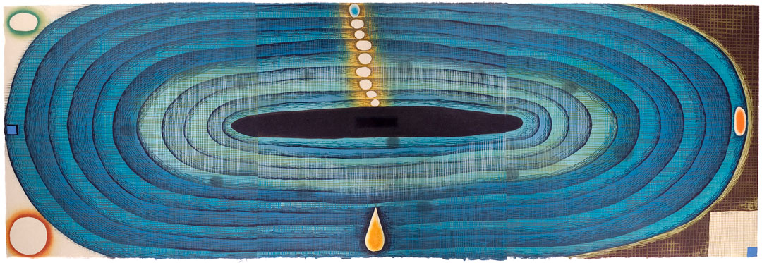
Above:  "Bell Acqua". Woodcut       Karen Kunc

I wish it was possible to download ones most favourite videos from You Tube,  as it is horrible when you go on there to look at something 'special' like for example videos covering a printmaking workshop where Karen was tutoring people on her approach to using woodcut, only to find that it has disappeared.
Fortunately the videos I wanted to look at are still on there.
I have viewed  them previously - I even made notes when I previously looked at them but that was ages ago and I am on a new computer by now and despite what they say about it being the case that you can transfer all of your data over to a new Operating System  - well that has not been my experience.  There are lots of bits and pieces that I can't seem to locate.......fortunately I haven't come up against anything critical and irreplaceable as of yet.
Let's just hope that, this remains to be the case.


Above: "The Wanting Pool" (detail) Karen Kunc


The Wood Block:

Birch Plywood seems to work well for this process.   It will of course need sanding too. Image can then be transferred to the wood block.  Use feint pencil for this. Karen mentions that she then uses a layer of shellac onto her woodblock.  This she applies by buffing it on, with a cloth.

I will use Lascaux acrylic hard ground as it will be easier and I know that it will protect the wood from being penetrated by the rolled on ink.  Additionally I don't want to go out and buy yet another product, such as Shellac, when I have already got something that will work just as well.


THE VIDEOS 
The videos were kindly uploaded by Mirka Hokkanen  She is an artist, originally from Finland, who has been living in the USA for quite sometime currently residing in Honolulu Hawaii.  I just love her "Bather" reduction relief print on the left - my cat used to groom himself similarly but these days I have to do all of his grooming for him and of course he doesn't approve of me trying to comb out his horribly dense tangles.

AS I mentioned I posted previously on my blog about these excellent videos, in which I just uploaded a photo of one of Karens woodcut prints and a link to the videos (which is now defunct).

Not to worry the link must have been on someones website which has now closed down.  The links I provide here, takes you straight to You Tube.

This time however - I have taken a different approach as I really want printmakers to share in the wealth of Karen's experience and my enthusiasm. So I have carefully watched through, the videos of this workshop which comprise of six videos of approximately 12 minutes each,  I did a lot of stopping and starting (which is an advantage if you are only able to watch the video recording as opposed to being present at the workshop, which took place at a place called Sev Shoon Arts Centre in Seattle, Washington State, USA.
I have included their website address but It was 'forbidden" when I tried visiting it a while ago, on both my web browsers i.e., Safari and Google Chrome.  For the sake of Seattle based printmakers I sure hope it hasn't closed down!?

There are some other videos on You Tube of Karen doing the actual cutting into the wood block with the Japanese style tools.  These look like the quite expensive ones that cost about £30 each but I suppose if one really wanted to use these then it would be a case of gradually buying the essential cutting tools and then looking after them and over time increasing the tools and materials. 

My focus herein, is on the inking methods and strategies.

Above: 1
Here we see Karen rolling ink in graduated colour ‘bands’ over the MASK(stencil) openings or ‘apertures’.  Remember these could be cut or even torn away shapes.


It seems that using ordinary craft brown paper works well for creating stencils and masks to use for inking the block.  It can be used as a way of keeping other areas clean of course and we have all probably used a mask in this way at least once in the course of our printmaking. 


Above: 2
Karen blending the edge of the ‘rolled on edge’ of the ‘inked areas’ with her finger tips, heal of the palm and the side of her hands - this will soften the edges of the inked areas where this effect is desired.  Seeing an artist working in this way makes me a lot more interested in working with woodcut I must say.  Those of you who are familiar with my work will know that I am "intaglio" orientated, in the main.


Of course the stencil sheet will need to be kept in place by using low tack adhesive.  Additionally one will devise registration marks for the printmaking paper which in this case is a Washi paper. Having the paper sheet smaller than the woodblock, make registration easier. Inks are Lithographic, being used for their higher pigment concentration and lack of dryer additives.


Above: 3
Here we see the effect of applying a ‘graduated roll’  to specific areas through the paper mask. ,  The dusky pink colour gives way through  to transparent and visually disappears to nothing - which I just love.  It's important to bear in mind that the ink being applied to these areas is with small brayers and that it has transparent extender mixed in with it.


Left:
Title: Land Escape"
artists book
Karen Kunc

Love the colours on this piece the shapes especially like how that upward curved edge to the paper totally 'adds' to the overall affect.

Left: 4
Here we can see the effect on the woodcut block - where Karen has inked the edges of a red 'triangular' shape.   This was achieved  inking around the edges of a cut-away triangle.  It shows how she inks around the inner edge of triangular cut away shape on the brown paper mask.  She also ‘softened’ it with her fingertips.
Left: 5

As the first proof seemed a bit too faint,   with this proof, you can see that Karen has added less transparent base, to her ink mix,  so that, in effect, as we can see, in this second  proof the blue appears darker to the eye.

Left: 6
Here you notice that each of the little circles have been rolled with different colours.  In some cases the stencil was cut in such a way that eg circle 'a' had been cut away so that the 'aperture' was 'smaller' than the circle itself.  In doing so - it opened up the possibility that its edge could be 'blurred' again by using fingertips.  It seems to me that your finger tips which are only lightly dabbed on to the wooden block and is that this is a more direct and sensitive means of achieving the gentle effect.  If one were to use eg a cotton ear bud it would be only too easy to take away too much.

Left: 7
Oops I have just realised that the next video still says more or less the same thing as number six but I will include it anyway so that people won't wonder "OMG what's happened to jpg number seven - oh I won't be able to get off to sleep tonight with worrying about it"!!


Left: 8
I ought to have mentioned that Karen makes two cut woodblocks.   One is a kind of 'positive' and the other a 'negative',  and these two woodblocks interrelate.  In cases where she might have had to cut-away large expanses of wood instead she cuts around the edge of the shape and then uses stencils to 'mask' the areas that should have been carved away.

Left: 9
It seems that with this process that the proofs come out better by the time you get to the 3rd or the 4th proof.  I have experience of this where Lino cut prints are concerned too.  The paper Karen was using in this workshop was called Nishinouchi - she seemed to think it was an excellent choice for woodcut printmaking.  It seems best to go through your pile of paper  checking for any 'foreign bodies' specks etc that might be on its surface before you actually start inking and printing.


Left: 10
Note in this video still - that you can see both of the inter relating woodcut blocks.
Karen also runs each sheet through the press prior to putting it through on an inked block.  She also puts one of these 'calandered' sheets of paper through the press(an etching press) on top of a block without any ink just to ensure that it behaves OK.
Leave these blocks inked as they are , for when you wish to do some further cutting away from the block.

Note you should always gradually add the colour ink to some transparent base that you have set out on your worktop.

Woodblocks that are slightly imperfect as in, they have for example a 'depressed area' of the block ( that you hadn't noticed before cutting the block) WILL NOT  'pick up' the ink strongly enough when rolled through the press.

In this case have a Baran handy and then you can rub or burnish that area by hand.


Bear in mind before you go onto the second stage of your carving away from your woodblocks that you could make a new differently designed stencil/mask.


Karen Kuncs Portfolio website

Artists print studios that she has set up


at Sev Shoon which has the 6 videos together

Saturday 27 April 2019

V is for Vietnam

V is for Vietnam


Massacre at Huáșż City, Vietnam

The “Huáșż Massacre” is something that took place in Vietnam not that long ago. It was in 1968 and was at the hands of two opposing forces within Vietnam itself.  Innocent people were shot indiscriminately, were beaten to death, were buried alive - it all took place over a period of almost one month.  The estimated amount of people who were murdered is about 4,000.  These included small babies, infants, children, their parents and also the elders.H


The Battle of Huáșż began on January 31, 1968, and lasted a total of 26 days.

"Ripple"   Jeff Murphy USA


During the months and years that followed, dozens of mass graves were discovered in and around Huáșż. Victims included women, men, children, and infants. The estimated death toll was between 2,800.
Here is a link to some eyewitness accounts on Wikipedia

Here is an image which represents a girl who was among those 'eliminated' Vietnamese people.


"Requium II"  Aine Scannell, UK


"OrnamenNov1"  Candace Nicol  USA


"Lost for Words"  Fiona Watson  UK


The image was created for a project organised by Paul Thomson as part of his PhD studies. It was an online digital exhibition.  As well as my own artwork I am including a selection of pieces from the Born Digital Portfolio.

U is for Umber


U is for Umber and I suppose when I think of Umber - what I’m seeing in my minds eye is actually what is called "raw umber”.   I don't know a lot about it other than, that it is considered to be within the ‘earth pigments’ category, and that it isn't as expensive as some other powder pigments.   The printmaking ink which I first started using was made by intaglio printmakers in London .

Now when you hear of another pigment that's called "Burnt Umber",  although you might imagine that it would be a darker version of the "raw umber”  - that isn’t always necessarily the case.  Different brands vary in what they offer.

Umber is a natural brown or reddish-brown earth pigment. Umber is darker than the other similar
earth pigments, i.e., ochre a kind of dark golden yellow and sienna a kind of brownish red.

In its natural form umber is referred to as 'Raw Umber'.

It had occurred to me that perhaps the word “Umbria” ( a place in Italy) was somehow connected to the word 'umber' - and indeed it is.   Apparently that was where the pigment was first located and extracted.  

As artists we all know that the umber coloured etching ink you get from Intaglio printmakers in London will quite likely be slightly different from for example Charbonnels etching ink.

If you are particularly interested in the scientific nature, of umber pigment then here is Wikipedia.
As mentioned, there can be variations that tend towards a slightly more yellow, red or even grey.


OMG..I had so much trouble with this umber coloured print.   It was originally drypoint on aluminium plate.  But it just wasn't 'happening' so after degreasing the plate I added pastel ground + sanded it gently so it'd hold more ink.I also made small figurative plates which also gave me grief.  I was making  prints for an exhibition my print workshop was hosting and I was running out of time!  So in the end I had to do some 'hand embellishment' using Carbothello water soluble pencils. I highly recommend them for this kind of task, they are not cheap but they are worth it and they last for ages.


What you see here is the 'background' onto which, the image below this, was created.  It shows a proof of some wooden planks that were inked intaglio and rolled through the etching press. The planks came from a dilapidated chest of drawers which my partner broke up and then I spotted them ...ah ha I said!

Ink in the grooves of the woodgrain was one of those visual effects that had eluded me for some time. And I have always been heavily orientated towards 'intaglio' printmaking, as opposed to relief.  Loving its intrinsic tactile embossed characteristic.  It took ages before I actually got around to doing something further with it. The wood was inked with London Intaglio ink + the paper sheet size was about 40 x 55 cm Hahnemuhle paper (my favourite).

I had come across this image from World War One, which showed a mother and her children who had to leave their home in Belgium and go seek refuge elsewhere. It was a low res image that I had worked into to improve sufficiently for use.  Throughout 2018 the BBC had broadcast a serial on Radio4 called "Home Front" which was set in Folkestone in the south of England and those two things along with a lot of the other cultural 'events' of 2018 compelled me to make this piece about them, even though I had no idea really who they were.  This makes me realise there are lots of photos around now (e.g., Syria, Myanmar) that in the future, will be like this photo, 'unknown'. I had never used so much coloured Inbe(blue) washi paper,  in one print before BUT I found it necessary.

ABOVE.  Title: “There but for the Grace” monoprint - wood intaglio, relief print and inkjet chine colle. 40 x 55 cm

Funnily enough I came across this photo while researching my photos for this post and came across this image.  It's what I call a 'print map'.  If I have anything with more than two 'elements' e.g., a piece of coloured Inbe paper and a plate element....then I have to do a photo (or I just forget).   However it does not mean that I will necessarily make the print.  I think this one is still sitting in the 'in progress' pile.

See how dark the umber coloured ink looks here - oh now that I think about it - this drypoint on polypropylene, was inked up using Akua Intaglio ink.  This is their "Burnt Umber".  I love how quick, easy and much less laborious, using these inks are.  They are soya based created by printmaker artists for professional use. Clean up with soap and water or sometimes even with baby wipes.  I am glad I made the change-over,  even though I could hardly afford it financially.  
I would buy a couple of pots from Artifolk (UK) every few months which would cost about £36. Gradually I built up the 'colour family' I needed.  Akua is now owned by Speedball (USA )- the people who do those excellent soft rubber brayers) I just wish they were wider than 15 cm (6 inches) AND had a bigger diameter.  I ought to write to them.


I made the heart image with an idea towards a final outcome. At the end of almost every 'vein' would be a small circular intaglio plate and underneath each would be a piece of inkjet chine colle paper with the image of a child who had been killed in the war in Syria.
  Again I wouldn't know who they were.   Honestly in a way I know its pathetic but as somebody who's disabled and financially challenged  - I feel powerless and inadequate where these people especially children are concerned.  It seems to me that sadly its really a form of legitimised murder. 


Wars are so horrendous and the longer they endure the more complex they become - I mean these people were just some citizens* having the audacity to ask that they be treated with respect... demanding they be granted their human rights....I kept wishing that someone would accidentally drop a few bombs onto Mister B. al-Assad's 'hang-out'. 
Above not the exact plan but a version I made using a pigment inkjet image with the drypoint intaglio heart on top.


Another thought I have had is ....I wonder how he explained the decimation of the entire country to his children.
"Well you see these terrorists(* ) were making street protests complaining about how bad I was and the government...Aye...they were breaking all the windows and attacking the policemen......so I had to defend us........as .they didn't like us 'Alawites' and would they would have come to our house and probably would have hurt you"............not well it hurt my over inflated ego so much that I thought no no no...I will not be dictated to by my own people.  "How dare they".

This final piece which uses umber for the intaglio elements eg the spider and the arch shape. It is printed on top of an ochre coloured aquatint background, the little sleeping figure on the right was made from a scan of a drypoint I had created earlier. It wasn't the right orientation - so I scanned it, flipped it, and out put it onto some washi paper to use as chine colle.
It's called Little Dreamer, and it's about 36 x 46 cm.

I like to think that this piece is somewhat more optimistic that it represents a child being surrounded by comfort and a place where they can play..but most of all have HOPE.

Friday 26 April 2019

T is for Trace Monotype

T is for Trace Monotype

When I started outing my training to be a fine artist - I trained as a 'painter' - I just didn’t know any better. The thing was though, that something just wasn't 'right’.Gradually over time I began to realise that I very much preferred working on paper.  AND the technique that I employed over many years before I got seriously into printmaking 'properly' was trace monotype.


Above: trace monotype on 30gsm Lokta paper 30x20cm


Of course the other problem was that I was always 'financially challenged' so of course, that affected the kinds of art materials that I was able to buy.

From the time I stopped more or less making paintings on canvas in my attic studio......I tended to use 'trace monotype' at the initial stages of creating new works.
I even remember that I used to like pressing the edge of the plate with my fingers to get that emboss-like mark at the edge of the image area.


Left: trace monotype on Lokta 30 gsm paper


I would say that about 50% of the time I would leave the monotype prints as they were.  The remaining 50%,  I would work into them further using oil pastels, watercolour pencils and watercolour crayons.  Of course that doesn't account for the ones that were just a total disaster and 'didn't even qualify for working on their back sides'!..This is something I do now - well given that printmaking paper isn't exactly 'cheap'  you can understand.

Above:  an example of a 'developed' trace monotype print
with oil pastel, carbothello pencils and soft pastels


On a good day I would create, about 12 prints.  The size was  approximately 44 x 64 cm and they were made on good grade Cartridge paper using oil based etching ink. I didn't have an etching press at that time.  At some point I experimented with using a very small amount of microcrystalline wax mixed in with the etching ink...and was very pleased with the result a unique velvet-like effect.
It's definitely the kind of thing that you can only truly appreciate by seeing it with your own eyes.  But this image of green ink on white paper (using the wax), gives a sense of the image.
Here is a link to a previous blog post about the procedure


PROCESS * TRACE MONOTYPE
For those who are unaware of this technique
Essentially, using a brayer you roll out a thin layer of intaglio printing ink onto a non porous surface eg metal or a perspex-like material (hereafter referred to as a plate / in printmaking terms).  You can use any shiny surface really.  I like to use a plate because I can then press around the edges to get that embossed mark.  Additionally with the 'negative' left on the ink plate - I can run that, through my etching press.  Sometimes these negatives have potential for further development.
image is from hotforwords on instagram........

There after,  place your paper on top of the inked plate.  Use masking tape along the top edge of the plate to keep it in place. You do not want it to be moving about as you are drawing/ impressing the pencil line onto the paper so that it picks up the ink.... then start drawing, mark-making and be aware that wherever pressure is put onto that paper, you are working on, marks, will result.  So don't just place your other hand on half of your paper area, or else you might just end up with a big U.F.O., blob of black ink, which might 'spoil' an otherwise fairly good trace monotype print.
image is from PaperWorks-Sonoran Collective


Trouble shooting
Check from time to time by lifting the paper to see how the 'ink-pick-up' is going if it is very faint you may need to press harder with your pencil.  It could also be that you have not applied enough ink.  Another possibility could be that you are using paper that is just too thick (100 gsm and above).

A certain amount of "dotty-ness" is 'par for the course', as in, this is the unique characteristic of the technique.  I suggest you do a test plate where you use a pencil, a stick of graphite, different grades of pencil 2H 3B and so on.   I like being able to see what I have drawn on the paper so that I can anticipate the 'look' of my finished artwork.

image:  (from copius.stones on instagram)

Using light blue ink random circular shapes demonstrates the "dotty-ness".  I have heard people refer to this as "noise" so it is a term that is used by printmakers.  Some noise is desirable but too much and the image is kind of wrecked.  You need to do this activity a few times, to 'get the hang of it'. 

In order to remove the top layer of ink, you place an old newspaper over the top of the plate and rub it all over the 'plate' in order to remove a 'layer' of ink.

Otherwise the lines that you draw onto the paper, with your pencil, will be too thick.I think for the first few images it is best to already have a feint drawing on your paper.
Image:  I did some trace monotypes into a book of poetry that was written in English and in Japanese.  I had to bear in mind the orientation of the image so I had to draw it the 'opposite way round' to how I wanted it to appear on the page.
You can have your 'design' drawn on your paper with lightweight pencil lines, that way when you start pressing the lines in the image, onto the paper placed over the inked plate, you will be able to see where you have 'drawn' your lines to pick up the ink on the plate.


TEST how the paper behaves - before you start making the image you want as your 'proper' artwork.  Just do something simple with some shading etc.You dont have to use the full size as per your final piece - just get a good sense of how the materials perform. It's always worth doing to avoid wasting time and money in the long run never mind utter frustration!

Image one of my trace monotypes developed further with chalk pastels


Of course the best way to understand how to do trace monotype is by watching somebody doing it so here is a video link
Image: which I found on the internet absolutely ages ago - I think it's an excellent use of trace monotype.  The way it sits between the two horizontal areas of Lino cut. I have been unable to attribute this artwork what a shame......


First an overview all in video by Belinda Del Pesco

Secondly a tutorial in 4 parts where all of the variables are explored including papers
These videos are by someone called "Craftybirdie" who is a UK based artist - that's all I could find out.

Trace Monotype Printmaking Part 1

Trace Monotype Printmaking Part 2

Trace Monotype Printmaking Part 3

Trace Monotype Printmaking Part 4