Showing posts with label monoprint. Show all posts

Sunday, 28 April 2019

W is for woodcut printmaking - Karen Kunc - the smart Way

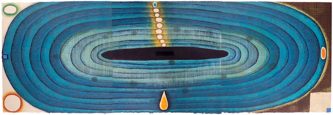
I have blogged on here in the past about an artist called Karen Kunc.  Her relief wood cut prints are mind bogglingly sophisticated.  I found it quite difficult to select which ones to include with this post because they look so complicated.
She has a lot of success commercially but for doing her own thing in her printmaking as opposed to making prints of animals and landscapes or seascapes, which sadly is what a lot of printmakers seem to do .   Having said that I do of course appreciate why they are inclined to make what sells..

Above:  "Bell Acqua". Woodcut       Karen Kunc

I wish it was possible to download ones most favourite videos from You Tube,  as it is horrible when you go on there to look at something 'special' like for example videos covering a printmaking workshop where Karen was tutoring people on her approach to using woodcut, only to find that it has disappeared.
Fortunately the videos I wanted to look at are still on there.
I have viewed  them previously - I even made notes when I previously looked at them but that was ages ago and I am on a new computer by now and despite what they say about it being the case that you can transfer all of your data over to a new Operating System  - well that has not been my experience.  There are lots of bits and pieces that I can't seem to locate.......fortunately I haven't come up against anything critical and irreplaceable as of yet.
Let's just hope that, this remains to be the case.


Above: "The Wanting Pool" (detail) Karen Kunc


The Wood Block:

Birch Plywood seems to work well for this process.   It will of course need sanding too. Image can then be transferred to the wood block.  Use feint pencil for this. Karen mentions that she then uses a layer of shellac onto her woodblock.  This she applies by buffing it on, with a cloth.

I will use Lascaux acrylic hard ground as it will be easier and I know that it will protect the wood from being penetrated by the rolled on ink.  Additionally I don't want to go out and buy yet another product, such as Shellac, when I have already got something that will work just as well.


THE VIDEOS 
The videos were kindly uploaded by Mirka Hokkanen  She is an artist, originally from Finland, who has been living in the USA for quite sometime currently residing in Honolulu Hawaii.  I just love her "Bather" reduction relief print on the left - my cat used to groom himself similarly but these days I have to do all of his grooming for him and of course he doesn't approve of me trying to comb out his horribly dense tangles.

AS I mentioned I posted previously on my blog about these excellent videos, in which I just uploaded a photo of one of Karens woodcut prints and a link to the videos (which is now defunct).

Not to worry the link must have been on someones website which has now closed down.  The links I provide here, takes you straight to You Tube.

This time however - I have taken a different approach as I really want printmakers to share in the wealth of Karen's experience and my enthusiasm. So I have carefully watched through, the videos of this workshop which comprise of six videos of approximately 12 minutes each,  I did a lot of stopping and starting (which is an advantage if you are only able to watch the video recording as opposed to being present at the workshop, which took place at a place called Sev Shoon Arts Centre in Seattle, Washington State, USA.
I have included their website address but It was 'forbidden" when I tried visiting it a while ago, on both my web browsers i.e., Safari and Google Chrome.  For the sake of Seattle based printmakers I sure hope it hasn't closed down!?

There are some other videos on You Tube of Karen doing the actual cutting into the wood block with the Japanese style tools.  These look like the quite expensive ones that cost about £30 each but I suppose if one really wanted to use these then it would be a case of gradually buying the essential cutting tools and then looking after them and over time increasing the tools and materials. 

My focus herein, is on the inking methods and strategies.

Above: 1
Here we see Karen rolling ink in graduated colour ‘bands’ over the MASK(stencil) openings or ‘apertures’.  Remember these could be cut or even torn away shapes.


It seems that using ordinary craft brown paper works well for creating stencils and masks to use for inking the block.  It can be used as a way of keeping other areas clean of course and we have all probably used a mask in this way at least once in the course of our printmaking. 


Above: 2
Karen blending the edge of the ‘rolled on edge’ of the ‘inked areas’ with her finger tips, heal of the palm and the side of her hands - this will soften the edges of the inked areas where this effect is desired.  Seeing an artist working in this way makes me a lot more interested in working with woodcut I must say.  Those of you who are familiar with my work will know that I am "intaglio" orientated, in the main.


Of course the stencil sheet will need to be kept in place by using low tack adhesive.  Additionally one will devise registration marks for the printmaking paper which in this case is a Washi paper. Having the paper sheet smaller than the woodblock, make registration easier. Inks are Lithographic, being used for their higher pigment concentration and lack of dryer additives.


Above: 3
Here we see the effect of applying a ‘graduated roll’  to specific areas through the paper mask. ,  The dusky pink colour gives way through  to transparent and visually disappears to nothing - which I just love.  It's important to bear in mind that the ink being applied to these areas is with small brayers and that it has transparent extender mixed in with it.


Left:
Title: Land Escape"
artists book
Karen Kunc

Love the colours on this piece the shapes especially like how that upward curved edge to the paper totally 'adds' to the overall affect.

Left: 4
Here we can see the effect on the woodcut block - where Karen has inked the edges of a red 'triangular' shape.   This was achieved  inking around the edges of a cut-away triangle.  It shows how she inks around the inner edge of triangular cut away shape on the brown paper mask.  She also ‘softened’ it with her fingertips.
Left: 5

As the first proof seemed a bit too faint,   with this proof, you can see that Karen has added less transparent base, to her ink mix,  so that, in effect, as we can see, in this second  proof the blue appears darker to the eye.

Left: 6
Here you notice that each of the little circles have been rolled with different colours.  In some cases the stencil was cut in such a way that eg circle 'a' had been cut away so that the 'aperture' was 'smaller' than the circle itself.  In doing so - it opened up the possibility that its edge could be 'blurred' again by using fingertips.  It seems to me that your finger tips which are only lightly dabbed on to the wooden block and is that this is a more direct and sensitive means of achieving the gentle effect.  If one were to use eg a cotton ear bud it would be only too easy to take away too much.

Left: 7
Oops I have just realised that the next video still says more or less the same thing as number six but I will include it anyway so that people won't wonder "OMG what's happened to jpg number seven - oh I won't be able to get off to sleep tonight with worrying about it"!!


Left: 8
I ought to have mentioned that Karen makes two cut woodblocks.   One is a kind of 'positive' and the other a 'negative',  and these two woodblocks interrelate.  In cases where she might have had to cut-away large expanses of wood instead she cuts around the edge of the shape and then uses stencils to 'mask' the areas that should have been carved away.

Left: 9
It seems that with this process that the proofs come out better by the time you get to the 3rd or the 4th proof.  I have experience of this where Lino cut prints are concerned too.  The paper Karen was using in this workshop was called Nishinouchi - she seemed to think it was an excellent choice for woodcut printmaking.  It seems best to go through your pile of paper  checking for any 'foreign bodies' specks etc that might be on its surface before you actually start inking and printing.


Left: 10
Note in this video still - that you can see both of the inter relating woodcut blocks.
Karen also runs each sheet through the press prior to putting it through on an inked block.  She also puts one of these 'calandered' sheets of paper through the press(an etching press) on top of a block without any ink just to ensure that it behaves OK.
Leave these blocks inked as they are , for when you wish to do some further cutting away from the block.

Note you should always gradually add the colour ink to some transparent base that you have set out on your worktop.

Woodblocks that are slightly imperfect as in, they have for example a 'depressed area' of the block ( that you hadn't noticed before cutting the block) WILL NOT  'pick up' the ink strongly enough when rolled through the press.

In this case have a Baran handy and then you can rub or burnish that area by hand.


Bear in mind before you go onto the second stage of your carving away from your woodblocks that you could make a new differently designed stencil/mask.


Karen Kuncs Portfolio website

Artists print studios that she has set up


at Sev Shoon which has the 6 videos together

Sunday, 27 May 2018

Artwork for Paris May 2018 Estampes +

Creating Monoprints for "Estampes+" ( May - June 2018) Paris

I spent nearly two weeks making these monoprints.  First I made a series of backgrounds by painting watercolour onto Yupo paper that I placed onto a polypropylene plate.   I also placed some small styrofoam rings onto some of them whilst they were still wet..........


Once they were completely dry - these were then run through the etching press onto dampened blotted paper Fabriano and Hahnemuhle paper.
A practical TIP for those of you making watercolour monotypes - is to use a digital timer to allow them to sit on the press bed, in position with the dampened blotted paper on top and then covered with the blankets - for 3 minutes. This is to give time for 'reactivation' of damp paper on dry paint.


I think I made about eight watercolour backgrounds to potentially develop further into finished monoprints.  BTW - it really is best to use a digital timer because its only too easy to get distracted by a phone call or someone asking you a question and so on and so on.............make sure it beeps and put it in your pocket etc......


I did the turquoise watercolour backgrounds first and decided that maybe these were just a bit too bright / intense ...........


Well you can see for yourselves.  I did end up using some of them although it was the 2nd batch that I  painted the following day - which I used moreso, for the backgrounds.


The next batch of watercolour backgrounds were a mix of ochre blue, yellow and burnt umber.  I have to say theres something very pleasing about working on the Yupo paper and you can easily remove it, in areas where you dont like the 'look' of.

       
On some pieces, I also used a little washing up liquid "Fairy" brand (UK the most expensive) - that's how I got all of those tiny bubble marks.  Having decided which of these watercolour backgrounds  to use it was then a matter of incorporating various elements into the 'picture space'.                                                                                                                                                           
"Daddy Long Legs"

Here an image of a young girl  I had drawn and painted ages ago  combined with an offset impression of a spider and a piece of cotton string that had been 'coloured' with watercolour crayon.

I have to admit this is a pretty tricky strategy as everything has to 'not move' once it has been put in place on the re-soaked  and blotted watercolor background.  It turned out sufficiently OK to 'pass muster' as they say.  I use rice paste on the girl image to adhere to the paper.  It's always best to not use too much paste because otherwise there is always the risk of it 'sliding or skidding' as it runs through the press and making a total mess.


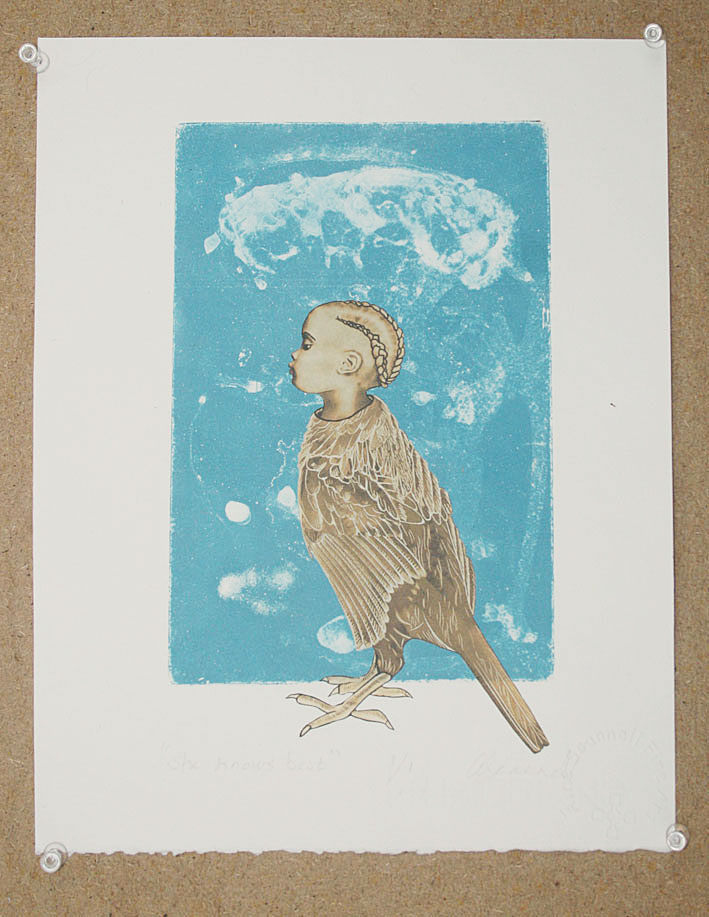
She Knows Best

This image which I had been working on lately didnt seem to integrate well with the watercolour backgrounds so instead I chose to use an aquatint plate made using the addition of water and washing up liquid as the aquatint was developed on the copper plate.  I think she looks really haughty.


This was one of the watercolour backgrounds that I did use although I'm still not quite sure about this one.

It was good to use some of this roughly textured  chine colle paper that had this nice graduated umbre/olive shaded colour.

It's an image of a female of sorts thats been around in my 'encyclopaedia of ciphers' for quite some time.

Thus far it is untitled.


Here (I really liked this back ground) I have incorporated my little emperor (PuYi) who in case you dont know was the last emperor of China.  What a life he lived.   It's an image I am fond of and that I have used previously although I am not sure as to whether it has featured in any of my finished artworks.

I incorporated a drypoint (on textured polypropylene) of a sphinx of an Ancient Egyptian cat.  My brother gave it to me as a bookmark, he had purchased for me in London at the British Museum.
That material really holds the ink well although I didn't bear that sufficiently in mind whilst making this print.

Really I should have done a more thorough wipe-away of the ink on the flat surface - which would have resulted in a paler impression of the plate.


However having said that I find that I have become more accepting of the overall appearance of the finished piece, than I was initially. The little bird (etched copper) was inspired from looking at a book about medieval illuminated manuscripts, another longstanding love of mine.

It doesn't have a title as of yet although maybe I might call it "Dislocation" or words to that effect.  That shape around the bird is a piece of thin cardboard that I varnished with Lascaux acrylic hard ground and when dry I rubbed some water-soluble crayon onto it.


"Sunday Best"

This piece is called Sunday best and it began with this image of a 5 yr old girl (Charlotte May Pierstorff), known by the name "May",who was sent in the postal service in the USA in the early 20th century by her parents.
See full details HERE   They couldn't afford the train fare and were 'sending' her to relatives for a few months to be looked after by them.  Perhaps it then made it possible for them to travel searching for employment.  I am just speculating not knowing of the real story of her family. It was a lot cheaper to 'send her' using that method.  With her being a child of course the USPS  had to deliver her at the address.  I imagine that the parents had not written the 'senders address' onto the 'package'. This was during the very early year of the U.S. postal service.
I loved the story + her photo integrated so well with the picture space I'd created in the watery cream + black coloured  background that I'd made a while back so that became another one of the pieces that I sent to Paris.

untitled                                                    


"Waiting for the Ancestors"

The final images - well the one on the left,  is the last of the four required images sent to Estampes+ 2018.  This was also  an earlier previously created watercolour background monotype.
The little animal figure on the left is lino print onto acid free tissue paper, that image was inspired by  looking at ancient Chinese funerary objects - in this case a container for the ancestors ashes.  The little red circle is imprinted with a tiny dry pointed circle on polypropylene - I love how easy it is to cut this material to a desired shape.


FINIT

Saturday, 11 October 2008

One of My Own Large Monoprints


This is a large monoprint I created during the period 1997-99. It's about 80 x 100 cm. I can not remember what kind of paper it's on although it is a fairly heavy gsm. I had access to a litho press in the printmaking studio at Wimbledon School of art and one of the technicians there Simon Burder, mentioned that you could actually use this to make monoprints so I thought that I would have a go.

Seeing it again makes me think that working in this way i.e., where I was just rolling up the plate with oil based extender, and then working into the plate with oil bars or oil sticks themselves as well as using a rag to rub away, would be an interesting method to explore again.

Using the image of the grid or chess board as a starting point and connecting a figurative element was a strategy that I explored time and time again. I had sketchbooks with 'Karisma' water soluble graphite pencil drawings ( no longer being produced - sadly) filled with these kinds of images with weird kinds of figures. I even made a bookart work of sorts, using trace monotype, as well as some made using acrylic , watercolour and indian ink - all in black and white.
I scanned them into my computer a while back. I have never done anything further with them though. I don't have a title for this piece as of yet by the way.
One irritating thing is the 'line' which runs across the centre, towards the right. It wasn't something that I noticed at the time. Looks like something was taped to the press bed perhaps ?! Anyway it rather spoils it. So maybe I will work on it further. I don't know yet.

There was a time when I used to employ oilbars a lot. I would make trace monotypes using etching ink and sometimes a tiny bit of microcrystalline wax mixed in with it.    This gives a gorgeous "velvet" like quality to the prints.   The thing with that technique though is that you have to add the correct amount of microcrystalline wax other wise it can go too waxy and thick making it impossible to work with.   Conversely if you don't put enough you hardly notice any difference.

Oh the other thing is to place some newsprint ( I mean a newspaper is fine it doesn't necessarily have to be blank newsprint or anything) and rub the ink rolled plate to get rid of the surface excess ink before you place your paper onto it to do your trace monotype.
Of course its best to use lightweight paper about 100 gsm or equivalent and it's a good idea to have a little 'bridge' made by using e.g. a couple of objects (about 1 inch or 2 cm's high) either side of your inked up plate, and then place e.g., a steel ruler or something similarly rigid across, so that you don't place unwanted 'pressure' on your paper and thereby marks resulting on the paper (which is face down on the ink). It really is best to do this or you will end up wasting your time and your paper. Best to practice initially using ordinary photo copy or printer paper.

I must look for those 'velvet' prints and consider working more with this technique but do it using a press. We have a lovely etching press at the FDPW print workshop, can't call to mind it's brand name but it would be interesting to see what difference it would make to run the 'ghosts' of the trace monotypes, through that press. I have even purchased paper for doing them - hence my doodle proofs to test the papers that John Purcell Paper sent me.

By the way anyone that is interested in trying the microcrystalline wax mix with the etching ink do get in touch so I can tell you how to prepare the wax so that it is then mixable with the etching ink.

Monday, 13 August 2007

Aran or putting my heart into it..............


Aran (detail)
Originally uploaded by ainesse.
This is my heart , well actually its an etched heart. It is part of the installation which I have been working on for months and months now.
I have at last uploaded the finished piece and some detail shots of the installation over on my Flickr pages.

Now I am trying to get the other artists on the exhibition roll, to post images to a pool I have set up on Flickr.

I just hope they don't take too long to get around to it and that they don't get too annoyed with my polite pestering to upload their jpgs of their finished pieces.
I don't know why but I am very fond of this image.................

Here are some links to other images relating to making my ARAN installation which took place over 6 months.


http://www.flickr.com/photos/ainescannell/collections/72157600449946618/

Sunday, 26 November 2006

Birna Matthiasdottir
Here is the only other image of Birna's which is viewable on the internet. Both pieces are monotypes.
A very talented artist is Birna and if you want to see some of her artwork in the flesh, in the UK, at the moment you can check out this show 'Looking out to Sea' which is an artists residency/exhibition project initiated by artist printmaker Sarah James.which is on at The University of Wales, Aberystwyth.until Dec 1st.

Update (25th January 2012) I have found another link to a site where you can see about eight of Birna's intaglio works ..............  http://www.thecoldpress.com/store/artist/birna-matthiasdottir