Friday, 12 February 2010

Three Bears Print (part 3)

After looking at all of the tediousness of the aquatint plates and so on in the previous post,  heres the actual mock up for how I,  sort of,  envisioned how the print would look.
This is a good thing and a bad thing.  Great in that I felt all excited about this print I was going to make and then not such a good thing - in that I was maybe expecting too much!!.   I had edited the image of the three bears in photoshop and then layered it on to in the case of this first image (green) the car spray aquatint.


I prefer this mock up as the bears in this case are layered over the  more organic looking (I think) spray of the hand pump spray.  At this point I wasn't too sure as to whether to have the bears "traveling" through a light or a dark strip.  But I really liked it and wanted it to be grainy and dotty.  The next step was to get the bear images photo etched onto the copper plate.

Three Bears (part 2)

This print i.e., of the three bears is still in progress.   I went as far as I could with it (which entailed a lot of trial and error) and then because the deadline for the project was coming up - I  had to put it to one side.      I have had some different ideas as to how I may finish it at a later date.    First and foremost I thought that I would make some aquatint background plates  and then another plate with the bears photo etched.                                                                                                                                                  However things turned out to be far from straight forward.    I made an aquatint using my salad oil spray pump to disperse the lascaux acrylic aquatint spray resist and the other was using car spray.
I asked  Bill,  at FDPW,  to go do the car spray paint job ( as I am horribly sensitive to all toxic fumes which can be generated from the various processes encountered in an open access print workshop. 
These were of course applied to degreased plates / zinc  for the car spray / copper for the pump spray.  The zinc plate was  etched in copper sulphate crystals mordant (with salt).                                                            
I most generally refer to that as"salt etch", and the copper in ferric chloride mordant.   So these are photos of the actual copper plate and then the zinc plate.  It's amazing how calmly and deftly Bill is able to get a lovely velvety spray onto the zinc!!!                                                                                                                                                                       I seem to remember that I proofed both of these before putting them in the mordants I usually do this if it is possible so that I can get an idea of how much of the plate is open to the mordant.                   
I did the proofs at home and forgot with the proof of the zinc plate that I had not put my "good blankets",  on my press so it gave an impression of lines going across the plate and white areas where there were holes in the blanket.  These were from one of my so called 'experiments' with rosary beads ( I think).  So then I had to re do the proof..........what a turkey!


Tuesday, 12 January 2010

The Three Bears (part 1)


No not THOSE bears, my three bears, but in actual fact I don’t know where the bears are…maybe still walking over the ice, that is, if there's still sufficient ice for them to walk over...............??
Anyway I have a love of bears as I know, many many people do, I didn't have a teddy bear when I was a kid but my brother B. did and he was part of our family of toy beings. I had my two dolls "Miranda" and "Delores" and B. had "Teddy" yep that was his name. He was quite a thread worn bear and we were all fond of him.
Myself and B. were horrified one day, when we heard mother had given him to the neighbours younger children. It wasn’t that we still played with him or anything but that he was a kind of family heirloom.

Anyway enough of our childhood traumas………so with this love of bears  - I have invariably been collecting photos as and when I encounter them over the years. 

So I decided I would make a print with bears in it and had this particular favorite photo which showed three bears going across the snow;  the two cubs following their mother.


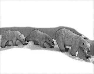
Here's the original image,  desaturated to black and white and with the essential elements of what I liked about the image - i.e., that they were kind of walking through a tunnel, which is representative of  their long journey to the sea, yet it is one that goes on year after year.

I had to spend almost one week going backwards and forwards to the image trying to introduce more tone to this black and white image so that when I converted it into a “bitmap”  image,  the dots would have sufficient variation to translate to the resist on the plate before it went into the mordant.


Lately a few members of FDPW have asked me about 
Converting an image for acetate print out , for photo etch on the light box.

So here’s what you do:

Before you do anything at all I would advise you make a copy of your image on your computer.

Prior to putting your image though the conversion process (to Bitmap) be sure and use the brightness/contrast option under IMAGE at the top options bars which you drop down to ADJUST and then across to brightness/contrast. 

In addition to this, which does everything all at once, all over, 
You can also  use the DODGE  tool…….the icon for this looks like a little  black lollipop
And
 the BURN tool …….the icon for this looks like a hand

These tools  are located in the seventh box down in the toolbox on the right hand side.. 

First choose the type of mark making device you want to use.  If you have never done this before and in a way for the most straightforward tool choose the number 2 pencil which is in the “dry media” list of tools.
Just along from the little icon which shows the tool you have chosen to use i.e., burn tool
Choose now the size of head you want i.e., for fine detail you may want 2 to 5 depending on your image size or pull the marker along the bar for a larger head eg  30.
Remember if you do any action in Photosop whilst editing your image to get the tones right then don’t worry because you can go up to the options menus at the top of the screen and choose “edit” and then the first option from the drop down menu, which  with the emphasis on darkening areas of your image. is “undo “ so if you do something you are not happy with then you can go a step back.
Shadows  :
 if you rub your tool over a dark area with your burn tool it will completely lighten that dark area (that’s with the exposure set at 100 %  I usually have it set quite low at eg under 20 %  But of course it depends on the image.
Midtones   If you put the dodge tool on this it will totally brighten such an area.  But again that’s with the exposure set at 100%
Highlights
If you put the dodge tool on this it will totally brighten such an area.  But again that’s with the exposure set at 100%

The Burn tool works in a similar way  But with the emphasis on darkening the areas of your image.


“Preparation of positives for photoetch”
 
When your image is ready for printing out onto your acetate  Here's what you do.

1
Have your image at a resolution of 200 dpi

2
Converted to black and white using the IMAGE bar at the top of the Photoshop drop down  options  go down to adjust and then across to DESATURATEwhich makes the image black and white.

3
Then go to IMAGE …………..MODE
Chose…………….GREYSCALE.

4
then chose  Image …..MODE….BITMAP
as part of that process a dialog box will come up and inside of that
for METHOD choose dither ( which gives a more random dot / speckly quality to the image)   for photo etching
for OUTPUT choose  200 dpi – this is what I have found works best for me.

That’s it

Essentially what you need to remember is that, the denser the dots the darker the tone.

You can buy OHP  Transparencies inkjet film,  from WH Smith.  I got a pack (60 sheets) A4,   which cost £19.99 and it has lasted me for absolutely ages –it still is about half full.

One more thing if your inkjet transparency that you print out doesn’t seem black enough – print another one and then line them up and tape them together which will help with blocking the UV light for your photo etch.


Monday, 4 January 2010

Polymer Collagraph on thin hardboard

What a sight this is - it looks like an awful mess and I suppose it is really.  It started out as an experiment that I wanted to do using  a process I saw mentioned in a book I wrote about in a post on the Fife Dunfermline Printmakers blog on the pluses and minuses of printmaking hand books.  Click HERE  to see the relevant technique.  Its the first box on the top left.  It involves ovens and freezers.  In the end I didnt dare put it into our oven as I was worried about the fumes it would create and I just chickened out.....maybe I will try it sometime soon though.  What a wooss!! ,  as Beavis and Buthead would say.
That reminds me I saw the second half of the most recent Simpsons movie, today when I got back from a 'get together' at Steves place (FDPW) and I actually hardly remembered any of it - so I really enjoyed it.   Getting back to this plate,  which I played around with a bit,  as a possibility of making one of the three prints to submit,  to the Wharepuke International Print project  - I used some polymer medium which I have had on my shelves for ages as it was mentioned in the book referred to above.

I proofed it and was somewhat disappointed in that the tones were all middle range and thinking on it again it may be that I should have done another proof and wiped it a bit more vigorously although it was actually very hard to wipe at all.  None the less I just wanted to get some idea of how it looked.

I had this image of a young woman deep in thought that I really liked and thought of using it as a chine colle element with the possibility of it being under the layer of the polymer proof although in these mock ups its just sitting on top.
I made some notes as I was going along which I often do to myself.  Thinking on other plates I have that I may incorporate into the composition.  The "sorry" plate mentioned is  a handwritten  square (ish) organically edged/ etched zinc plate 10 cm x 10 cm.     I still have to go back to this plate, and continue with it. Although I have added some lighter and darker tones to it - I have yet to take another proof.  I had several possibilities on the go at the time and this was one that just got put to the side.  I had to cut the plate down from its original size which was about 20 x 26 -- whatever it was originally it then became  more  rectangular and able to fit onto A4 size paper - which was one of the requirements for  Wharepuke

Sunday, 3 January 2010

Making Miniprints 6


Just to conclude from the four previous posts on the subject - Once I had settled on the colour for the 'background" and printed a few of them up I thought I would try out another image before I got stuck into the "twins entwined" image.  I had this image from an infant anatomy that I came across and its from the early 1800's I seem to remember I had distorted it and gave it a whirl but nah .  Nothing doing.    I even ytied it a second time on a stronger background but still it just didn't work for me.


With the small lower plate it certainly was troublesome keeping a sense of consistency as it was done using monotype as in, scrunched up 'Kit Kat' foil wrapper, dabbed onto a layer of rolled on green ink.     You can see that from the two 'blank backgrounds on the left - also time was running out eek !!!
Also I had tried to ensure that I had mixed up enough of that particular colour green which was made from 3 colours  - which I now can't remember.    Just as well I don't have to make any more of those prints.!!!
  I did far more 'backgrounds'  than I needed at least about well say 18 altogether.  Many just had a tiny unwanted mark or thge plate was ever so slightly crooked.  Tia came round one of the Saturdays I was working on this with her daughter Michelle,  who had previously done a bit of printmaking in the studio working on a few small drypoints on perspex and had made one lovely little print which I must get a jpg of to post on here.


I was really pleased when M said she  wanted to help while her mum went off to town, to  meet a colleage  about a project.     I got M. to help with inking up and rolling and I seem to remember she even did a few of the "scrunchings"  of the small monotype plate element.  I was also having to make up more colour by now so there was a small amount of variation in the colour but I tried as hard as possible to maintain the consistency.
Here's another fun one I tried out I made this little creature ages ago but am fond of it and will at some point include it in a piece for some reason or other though I decided against it at the time.

I fiddled about with the image of the twins in the dress which incidentally was  a scan from a collagraph I made from an actual girls dress,  that I have yet to possibly make into a print.  I thought it didn't look right just being straight down and wanted it to somehow feel or be suggestive of a botanical plant.

Then there was the matter of getting the color hue correct so it either had to be reddish or more dark green.  Some of the more astute observers may by now have noticed that the smaller plate was by now positioned in the lower half of the image as opposed to the other way round .
 This had been my previous arrangement and I still wasn't happy with things.
 I happened to ask C.'s opinion on this and he suggested turning it upside down and then it just seemed right.  Mostly I don't take too much notice of stuff he says but on this occasion.... ....

Of course once I was OK with that I had to have a little effort at doing a different effect with the little plate area but then thought that that might too "fiddldee  diddledee" to effect for the amount of proofs I'd need to do so best to stick with what I had already done.  Then one final stab with the scissors to see what that would look like and I quite liked it.  I managed to get the edition of 10 sent off just in time to meet the deadline and felt quite happy with what I had sent off.  If you want to see the actual finished print then check out my print and the work of the numerous other printmakers internationally who contributed to this project which was very well managed and co-ordinated by Green Door printmakers in Derby.  They seem like a really friendly and lively print studio.